I was involved in implementation of couple Oracle SuperCluster system in Poland. Here they are mainly use in consolidation projects – where single machine runs dozens of Oracle databases (or applications, but this less common).
My personal opinion is that – comparing to Exadata – SuperCluster is better suited for consolidation. One reason for that is flexibility of virtualization which means that you can divide platform resources on many levels. You can create dedicated domains, I/O domains or zones and build multiple clusters on single system (planning configuration of such systems was really nice exercise to me). Further you can take advantage of so called projects, roles and RBACs, which can be used to further separate databases running within single operating system instance. And there is no (or very little) performance overhead when you use virtualization of this kind.
Second reason is related to SPARC processor and its features. Comparing to Intel it usually has higher latencies but overall throughput is better. It also accepts overloading better then x86 platform. Single SPARC M7/M8 core has 8 hardware threads (called strands) – comparing to Intel – 2 threads in HT mode. Single socket has 32 cores so Solaris operating system recognises this as 256 virtual processors. Given that single SuperCluster M7/M8 domain can span four CMIOU boards (so 4 SPARC processors) – this can results in single cluster node with up to 1024 vcpus (128 cores).
On such a platform NUMA aspects are important. Solaris operating system tries to take into consideration internal architecture of CPU and memory. For example the fact that M7/M8 cores are sharing L2 (every two cores) and L3 (every four cores) caches. You can check NUMA topology using lgrpinfo and pginfo commands which gives output like below:
lgroup 0 (root):
	Children: 1 2
	CPUs: 1504-1535 1840-1855 1896-2047
	Memory: installed 957G, allocated 782G, free 175G
	Lgroup resources: 1 2 (CPU); 1 2 (memory)
	Latency: 27
lgroup 1 (leaf):
	Children: none, Parent: 0
	CPUs: 1504-1535
	Memory: installed 479G, allocated 395G, free 84G
	Lgroup resources: 1 (CPU); 1 (memory)
	Load: 0.418
	Latency: 20
lgroup 2 (leaf):
	Children: none, Parent: 0
	CPUs: 1840-1855 1896-2047
	Memory: installed 479G, allocated 387G, free 92G
	Lgroup resources: 2 (CPU); 2 (memory)
	Load: 0.401
	Latency: 20

0 (System [system]) CPUs: 1280-1535 1792-2047
|-- 5 (Data_Pipe_to_memory [chip]) CPUs: 1280-1535
|   |-- 4 (L3_Cache) CPUs: 1280-1311
|   |   |-- 3 (L2_Cache) CPUs: 1280-1295
|   |   |   |-- 2 (Floating_Point_Unit [core]) CPUs: 1280-1287
|   |   |   |   `-- 1 (Integer_Pipeline [core]) CPUs: 1280-1287
|   |   |   `-- 7 (Floating_Point_Unit [core]) CPUs: 1288-1295
|   |   |       `-- 6 (Integer_Pipeline [core]) CPUs: 1288-1295
|   |   `-- 10 (L2_Cache) CPUs: 1296-1311
|   |       |-- 9 (Floating_Point_Unit [core]) CPUs: 1296-1303
|   |       |   `-- 8 (Integer_Pipeline [core]) CPUs: 1296-1303
|   |       `-- 12 (Floating_Point_Unit [core]) CPUs: 1304-1311
|   |           `-- 11 (Integer_Pipeline [core]) CPUs: 1304-1311
...
But there are bugs…
On one platform issue has been detected which manifested itself as intermittent slowdowns of SQL queries execution times (queries which were CPU-bound) which did not fully matched overall system load characteristic. Also looking into Enterprise Manager Cloud Control screen showing Solaris/SPARC CPU load distribution – we had an “impression” that some cores seems to be more loaded than other (an it was like these couple cores looks always more busy then other – which is really unusual). But this was difficult to prove in Cloud Control. The plot in EMCC depicts thread number on X-axis and utilization on Y – so this is just current snapshot of load distribution among cores. It does not tell you directly how this load is changing over time.
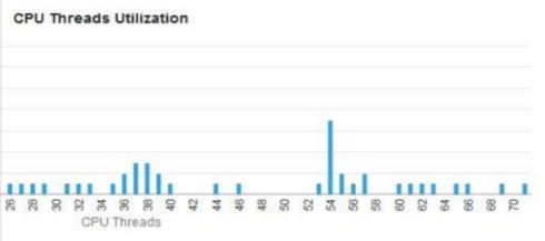
To make things complicated – the system utilizes Solaris zones which on SuperCluster are bound to its individual processor pools. The processor pools are sets of vcpus (or cores) defined at operating system level to which processes can be bound. They can be used independent from zones but typically these are zones which take advantage of them. Anyway, non-uniform vcpu utilization was expected, i.e. single zone would utilize only subset of cores (that belong to pool associated with this zone) shown on domains performance screen in EMCC. But still we saw that small subset of cores in the pool are more busy then other so our “impression” was worth to check.
We stared to gather more system performance metrics, amongst other:
- Average system utilization as shown by
uptime/prstatcommands - Processor group utilization reported by Solaris tool
pgstat.
We collected data for couple days and were trying to visualize them. This is were Python, Pandas and Jupyter Networks might be useful and with only small effort we created chart like this:
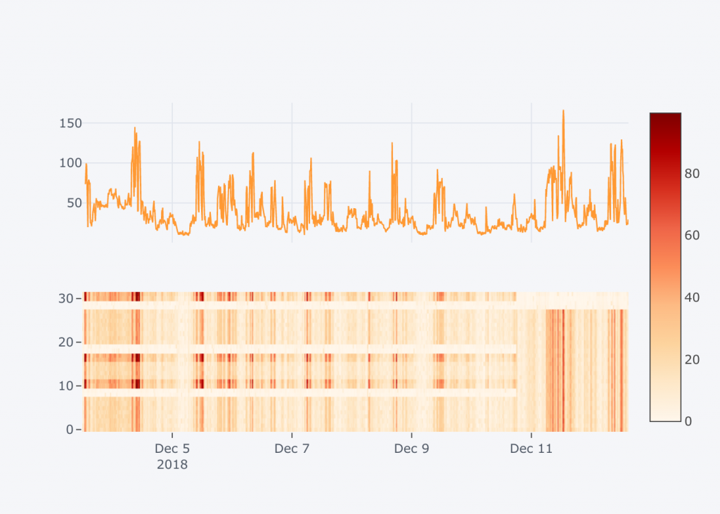
What you see above are two plots synchronized over time on X-axis. Upper plot depicts system load measured inside the zone. Lower plot uses heatmap to present how particular cores are utilized over time. The Y-axis in this case tell you core number, and Z-axis – which is reflected by intensity of red color – represents core utilization.
Such a kind of plot proved immediately that our “impression” was right. Cores 10,11,16,17,30,31 were always utilized more then the other. It is also worth to mention that cores 8,9,18,19,28,29 were not part of the pool used by the zone. They were actually part of default pool – so not used by any zone and therefore much less utilized then other (shown as bright horizontal stripes on bottom diagram). Domain where this was measured had even more cores (32-63) – but they were also part of default pool or the other pools used by different Solaris zones.
We created support ticket at Oracle showing this anomaly and got the feedback really quickly pointing to this internal bug:
- Bug 17575040 : Scheduler doesn’t handle processor groups spread across psrsets correctly
The bug has been already fixed in newest Solaris 11.3 SRU but we could not install QFSDP at the moment. So we (dynamically) transferred cores between pools to align them with processor groups (the four core sets sharing same L3 cache). You can see how this change immediately led to uniform load across all cores – just look at bottom plot starting at 10th of December on 7 p.m.
Actual calculations
I’m attaching piece of code which was used to create above diagrams. It uses dockerized Jupyter Notebook which I described in my previous post.
import pandas as pd
import cufflinks as cf
cf.go_offline()
Load and process input files
Solaris 'prstat' and 'pgstat' outputs have been preprocessed using awk/sed to interim shapes better suited for Python Pandas dataframes.
Data is then strongly downsampled - only for publishing on blog (to limit amount of data included into html page).
prstat = pd.read_csv(
    '/in/prstat.csv.gz', header=None,
    names=['Time', 'Second', 'Procs', 'Load', 'User1', 'User2', 'All' ]).fillna(0)

prstat.set_index(pd.to_datetime(prstat['Time']) +
                 pd.to_timedelta(prstat['Second'], unit='s'), inplace=True)

load = prstat['Load'][prstat['Load']<300].interpolate().resample('30min').ffill()
pgstat = pd.read_csv(
    '/in/pgstat.csv.gz', header=None,
    names=['Time', 'Second', 'Probe', 'Core', 'Int_HW', 'Int_SW', 'Float_HW', 'Float_SW'])

pgstat.set_index(pd.to_datetime(pgstat['Time']) +
                 pd.to_timedelta(pgstat['Second'], unit='s'), inplace=True)

cores = pgstat.set_index('Core', append=True)['Int_SW'].unstack().resample('30min').ffill()
load.tail().to_frame()
cores.tail()
Visualizing system load
System load (taken from 'prstat' output) shows average load of all CPUs:
load.iplot()
In this case this does not give full information about the issue. It is better to look into utilization of individual cores:
cores.iplot(kind='heatmap', zmax=True, colorscale='OrRd')
Show both plots together
fig1 = load.iplot(asFigure=True)
fig2 = cores.iplot(kind='heatmap', zmax=True, colorscale='OrRd', asFigure=True)
figures = cf.subplots([fig1, fig2], shape=(2,1), shared_xaxes=True)

cf.iplot(figures)
Hi,
thank You for this blog post, inspired to use even more python and visualizations :).
Regards.
G